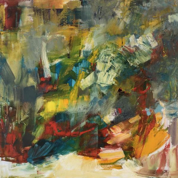
At first this piece may give off a sense of chaos but the color placement and brush strokes give the composition a cohesive look and sense of movement. The bright red color surfaces strongly when focused on but fades away to emphasize the blue and green tones around it. The longer I look at it, the more changes in my eyes. The little patch of seafoam green stands out to me as geometric and abstract and catches my eye through it’s contrast with the surrounding shades of blue and yellow. The color palette in the center of the composition is emphasized by the surrounding shades taller and more earthy tones. When broken up that color, the peace becomes more aesthetic to me and my eyes can settle on the sheet was formed by the well placed brushstrokes and thickly-layed paint.
This piece is made even more intriguing because of its connection to the Melodies on Canvas collaboration between the Art Center and MIC. The use of color and brushstrokes make me think of a melody comprised of staccato notes and a very commanding presence.